How to Design Seek and Find Puzzles for Print Puzzle Books (Black & White First, Smart Grayscale Second)
A creative guide to designing high‑contrast, print‑clean Seek and Find puzzles—built on silhouettes, line art, letters, and numbers—without relying on color.
Why Seek and Find Works Beautifully in Black & White
Seek and Find puzzles don’t need color to shine. The appeal lives in visual discrimination—spotting shape and contour patterns, noticing subtle variations, and deciding what belongs and what doesn’t. When you remove color, you’re forced to compose with essentials: form, spacing, contrast, and orientation. That’s a feature, not a limitation.
- For young solvers, bold silhouettes and generous spacing make recognition and counting feel satisfying and fair.
- For adults, rotations, mirroring, tight spacing, and look‑alike symbols create the delicious “is it / isn’t it?” tension that keeps eyes scanning and minds engaged.
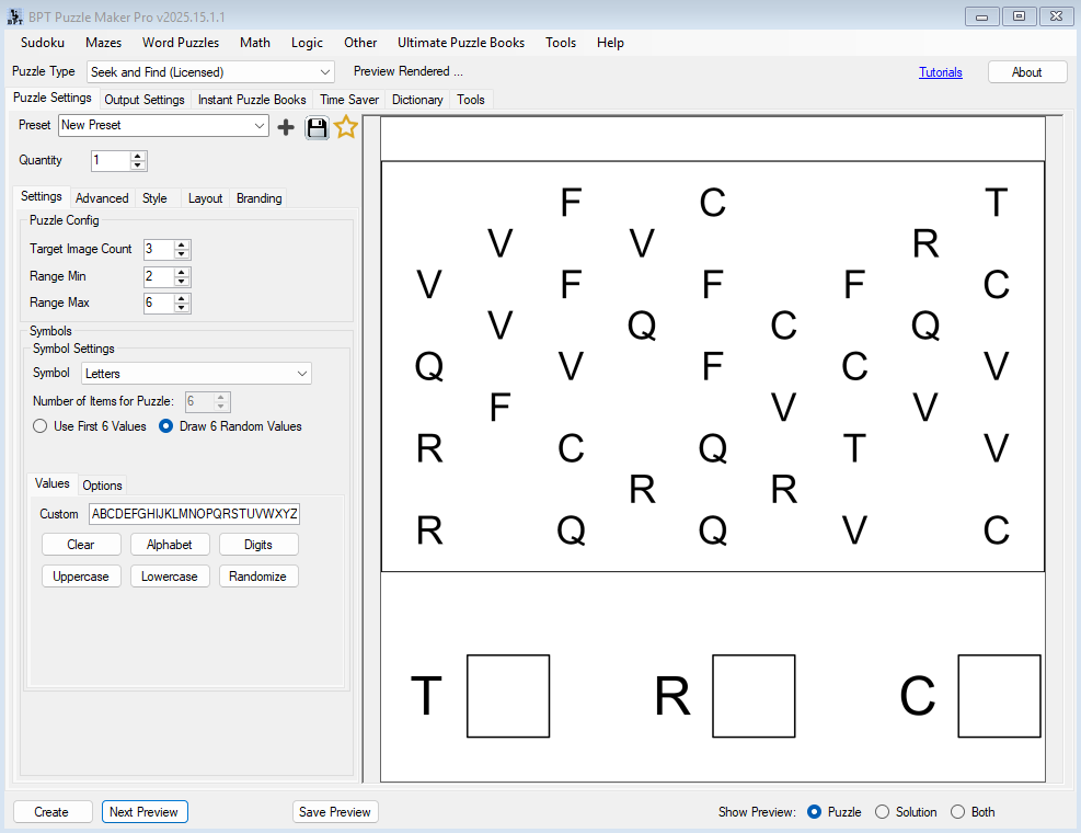
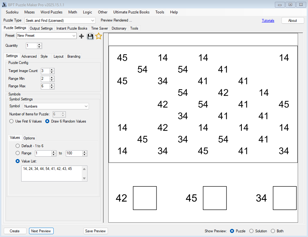
In the current version of Puzzle Maker Pro – Seek and Find, each puzzle uses one content type at a time—images (silhouettes or line art), letters, numbers, or colors. Because this article is for print puzzle books, we’ll focus on black & white (and a little grayscale), so our content palette is: silhouettes, line art, letters, numbers (no color). Randomization ensures that even with the same settings, every output is unique, which is perfect for puzzle books and series.
The Creative Levers That Shape Difficulty (and Delight)
Think of Seek and Find design as a set of dials you can combine:
- Content type: silhouettes/line art, letters, numbers
- Grid scope: small vs. large grids change scan effort and visual density
- Fill density & spacing: sparse layouts read easier; dense layouts feel tougher
- Noise ratio (decoys): how many near‑miss symbols appear among targets
- Orientation: rotation increments and mirroring (or upright only)
- Symbol similarity: how closely your decoys resemble the target
- Legend clarity: how “what to find” is communicated (and shown) at a glance
You’ll use these dials to build puzzles for different audiences—from friendly to fiendish—without ever reaching for color.
Silhouettes: The Black‑and‑White Powerhouse
Silhouettes are the most print‑proof way to build B/W Seek and Find puzzles. They pop off the page, read clearly even at modest sizes, and can scale from “gentle” to “gotcha” with a few choices.
What works best:
- Shape‑distinct families. Pick symbol sets whose outer contours are easy to tell apart: dolphin vs. turtle vs. crab; wrench vs. hammer vs. saw; maple leaf vs. oak leaf vs. ginkgo leaf.
- Filled silhouettes for clarity. Solid black shapes maximize contrast (great for kids/entry levels).
- Outline‑only silhouettes for nuance. Clean outlines add variety without relying on tone—just keep line weight confident so edges don’t disappear.
- Progressive similarity. Start with clearly different profiles, then introduce closely related silhouettes (e.g., three different birds in profile) to challenge experienced solvers.
Creative idea: Build an “Animal Tracks” Seek and Find using silhouette track shapes only. Begin with distinctive prints (deer vs. duck), then level up with similar paw outlines (fox vs. small dog).

Line Art: Detail Without Color
Line art lets you add texture and personality—just be thoughtful about stroke weight and clutter.
Design notes:
- Use consistent, confident strokes. Hairline details risk vanishing in print. Lines that feel too thin on screen will feel even thinner on paper.
- Pattern as “grayscale.” If you want a hint of tone without gray ink, use hatching, dots, or stripes inside the symbol. Patterns keep edges crisp and don’t depend on delicate tonal shifts.
- Simplify interior detail. Add just enough to differentiate similar objects (e.g., two types of leaves) but avoid overdrawn textures that turn into mush at small sizes.
Creative idea: A “Tools & Gadgets” set with line art icons (wrench, spanner, pliers), each with a distinct pattern fill (dots, cross‑hatch, diagonal stripes) so readers can tell them apart instantly.
Letters: Recognition vs. Confusion (Your Choice)
Letters are a gift for B/W Seek and Find because the brain wants to autocorrect them. Tilt, flip, or mirror a letter and you instantly add cognitive load—perfect for adult‑level puzzles.
For early literacy:
- Stick to uppercase, upright orientation, and wide spacing.
- Choose a high‑legibility face (clear strokes, sturdy forms).
- Avoid famous confusables at first (I/l/1), then introduce them once readers are warmed up.
For grown‑up challenge:
- Lean into confusion families: b/d/p/q, M/W, N/Z, 6/9 (yes, numbers work here too).
- Introduce limited rotation (e.g., 45° or 90°), then mirroring once solvers are comfortable.
- Tighten spacing and increase fill density. The puzzle becomes a visual minefield—in a good way.
Creative idea: “Mirror Mayhem” series: each page targets one pair (e.g., b & d), with mirrored copies sprinkled among upright forms. A nightmare for quick scanning, a dream for puzzlers who enjoy meticulous hunts.
Numbers: Simple Forms, Big Challenge
Numbers look simple. That’s why they’re powerful. Small orientation changes make common pairs (6/9, 2/5, 3/8) surprisingly tricky to spot under pressure.
For kids and casual solvers:
- Keep numbers upright with generous spacing.
- Avoid the notorious pairs until later.
- Vary grid size to control session length and confidence.
For advanced solvers:
- Introduce rotation (quarter or half turns work well).
- Add look‑alikes intentionally (6 among 9’s, 2 among 5’s).
- Increase density and narrow the spacing. The eye must slow down.
Creative idea: “Almost Twins” numbers book—every page pits a target digit against its most confusing pair, with rotating roles across the book (the target changes; the decoy family evolves).
Target vs. Decoy: How to Challenge Without Cheating
The difference between a loved puzzle and a “this isn’t fair” experience is how you design decoys.
For kids/easy tiers:
- Use decoys with clearly different shapes (apple vs. triangle), not similar silhouettes.
- Keep the noise ratio low (few decoys).
- Ensure target examples in the legend box are large and unmistakable.
For adults/hard tiers:
- Use near‑miss decoys: same category, similar contour, slight axis changes.
- Increase decoys and add orientation variance.
- Keep the legend clear (show the canonical target), but let orientation vary in the grid.
Rule of thumb: Start with 3–6 targets per symbol family and scale up as density and grid size increase. If a page feels chaotic, don’t add more targets—strengthen separation (slightly more spacing, simpler decoys).
Difficulty Recipes for Black & White (No Color Needed)
Here are field‑tested “recipes” that reliably hit the right feel:
Young learners / Easy
- Content: Bold silhouettes, or uppercase letters with clean forms
- Grid: Small to medium
- Orientation: Upright only
- Density: Low
- Noise: Minimal
- Spacing: Generous
Family / Medium
- Content: Simple line art or letters with a few look‑alikes
- Grid: Medium
- Orientation: Limited rotation (e.g., 45° or 90°)
- Density: Moderate
- Noise: Moderate
- Spacing: Comfortable but not airy
Adults / Hard–Extreme
- Content: Letters/numbers with confusion families, or similar silhouettes
- Grid: Large
- Orientation: Rotation + mirroring
- Density: High
- Noise: High
- Spacing: Tight (but avoid symbol collisions)
These combinations scale difficulty cleanly without using color. They also make it simple to sequence a book from easy to extreme—more on that in your separate “book structure” article.
Layout, Legend, and Readability Details That Matter
A puzzle can be clever and still fall flat if the page design feels busy or vague.
- Legend clarity: Show the target examples at a comfortable size and keep labels simple: “Find and count…” Avoid color language (“find the red ones”) in B/W books.
- Grid borders and separators: Use confident line weights that remain visible in print and at small thumbnail images online.
- Whitespace as a tool: Leave room around your grid, legend, and header. A little breathing space makes dense puzzles feel approachable rather than punishing.
- Avoid micro‑gaps: Ensure symbols never touch each other or the cell border; tiny contact points can read as “merged blobs” in print.
Seek and Find–specific note: The software always exports puzzle and solution as separate files. That’s perfect for books—solutions can live at the back, with numbering tied to each puzzle page.
“Grayscale, Carefully”: When and How to Use Tone
You can produce a stunning B/W book with zero grayscale. But if you choose to use it—use it like spice.
- Treat grayscale as texture, not identity. The reader should never rely on a 5% tint to decide what’s a target.
- Prefer patterns over tones. Light hatching or dot fills stand up better to different printers and papers.
- Stay away from delicate transitions. Large, low‑contrast gray fields can band or fade. If something barely shows on your monitor, expect it to vanish in print.
- Print a test page. A one‑page home print reveals more than an hour of guessing.
Theming Without Color (Ideas That Sell)
Silhouette themes
- Nature & Animals: ocean life, birds, forest mammals, insects, farm life
- Everyday Objects: tools, kitchenware, stationery, vehicles, toys
- Outdoors: camping gear, hiking equipment, fishing tackle
- Botanical: leaves, flowers, seeds, tree outlines
Letter/number themes
- Letters: “Vowels Vault,” consonant clusters, “Mirror Mayhem,” “Diagonal Drift” (rotation focused)
- Numbers: even/odd hunts, “Almost Twins” confusion sets, primes, sequences
Series planning
- One theme per book for strong branding and keyword relevance, then escalate difficulty across volumes:
- Volume 1 = silhouettes, upright, wide spacing
- Volume 2 = line art + limited rotation
- Volume 3 = letters/numbers with mirroring + tight spacing
Craft Notes Specific to Seek and Find (Product‑Accurate)
- One content type per puzzle. Build puzzles around images (silhouettes/line art) or letters or numbers. You can mix content types across a collection, not within a single puzzle.
- Randomization built‑in. Even with the same settings, each output varies—ideal for books and printables.
- Puzzle + solution export. Always saved as separate files (JPG/PNG/PDF), which simplifies book assembly and keeps solutions clean at the back.
- Instant Puzzle Books included. Standard layout places one puzzle per page, which is reliable for B/W interiors. If you publish at scale, the Creator Edition unlocks additional layout options and batch workflows, but your B/W design principles remain the same.
Quality‑Assurance Checklist for B/W Interiors
Use this quick pass before you compile interiors:
- Symbols remain distinct at print size (no collisions or ambiguous edges).
- Line work looks confident (no hairline strokes).
- Legend is obvious (target examples large enough to confirm identity).
- No color‑dependent cues or instructions anywhere.
- Tight pages still feel fair (hard ≠ unfair; win the reader’s trust).
- One‑page print test passes (what you expect to see is what you see).
Design Recipes (Examples You Can Reuse)
A. Silhouette Starter (Kids / Easy)
A 9×9 grid using bold animal silhouettes, upright only. Low density, generous spacing, 3–4 target types with small, obvious decoys. Legend shows large, clean examples. The whole page says “you can do this,” and that confidence turns page‑one solvers into page‑two fans.
B. Letter Lift (Family / Medium)
A 12×12 grid of uppercase letters with a few look‑alikes (E/F, P/R). Limited rotation (45°/90°) appears on decoys but not all targets. Density moderate; spacing comfortable. The eye slows down just enough to feel the hunt.
C. Mirror Maze (Adults / Hard)
A 16×16 grid of letters with mirroring + rotation (b/d/p/q, N/Z, M/W). High density, tighter spacing, higher decoy ratio. The legend shows canonical upright forms; the grid tests orientation tolerance. It’s intense—but fair.
D. Number Doubles (Adults / Hard–Extreme)
A large grid centered on 6 vs. 9 and 2 vs. 5. Rotation everywhere. Decoys are deliberate and plentiful. Legend is crystal clear; the satisfaction of beating the pattern keeps readers hooked.
Why Black & White Can Be Your Competitive Edge
Plenty of puzzle books lean on color to attract attention. But a well‑designed B/W Seek and Find has two big advantages:
- It photographs/prints consistently. No disappointing dulled hues—your design reads the way you intended.
- It scales to extreme difficulty gracefully. Shape, orientation, spacing, and similarity let you tune challenge with surgical precision.
Readers don’t remember a palette; they remember a feeling—the moment the right symbol pops, the rhythm of small wins, the quiet focus of a good hunt. You can deliver all of that in pure black and white.
Wrap‑Up
Designing Seek and Find puzzles for print puzzle books without color isn’t a compromise; it’s a craft. By focusing on shape, contrast, spacing, and orientation, you’ll create pages that feel clean, fair, and deeply engaging—whether the audience is learning their letters or chasing a late‑night challenge.
If you’re building a single title or a full series, the principles above will keep your puzzles crisp in print and compelling on the page. And because Puzzle Maker Pro – Seek and Find exports puzzle and solution separately (with built‑in randomization), you’ll move faster from idea to finished interior—without losing any of the artistry that makes great puzzles memorable.
Ready to create print‑clean Seek and Find puzzles for your next book?
Explore Puzzle Maker Pro – Seek and Find and start designing B/W puzzles that scale from friendly to fiendish with a few thoughtful choices.
https://www.bookpublishertools.com/product/puzzle-maker-pro-seek-and-find/